TxM 008 Section 1.6 What is NOT a Strategic Engineered Precision Taxonomy? Created by James on 6/26/2013 4:14:19 PM
In seeking to explain what a Taxonomy is it is useful first of all to consider what a Taxonomy is NOT.
In particular, what is NOT a Strategic Engineered Precision Taxonomy.
Following are a few examples of lists from ERP implementations which are NOT taxonomies:
1. Credit note reason code example
The following example of Credit Note Reason codes is NOT a Taxonomy:
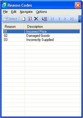
At first glance this might look reasonable, however, the list is coded sequentially and there is no information about the nature of incident that gave rise to the Credit Note.
Any management query relating to the nature of damage or the nature of incorrect supply will necessitate a fairly senior person to go to the database and analyse the transactions.
Typically this will require exporting the transactions into Excel and then creating some form of manual analysis which can then be supplied to management in order to answer the question "what was the nature of …". In the event that this report triggers further questions it will be necessary for the same reasonably senior person to return to their spreadsheet and look for answers to those further questions.
If, as frequently happens they only brought the information they needed into their spreadsheet they may need to do another query and do further analysis which, because it is all manual, may not exactly return the same results of the first query resulting in frustration and distrust of the system.
Contrast this with the following SEPT list produced in consultation with the management of the particular client organization concerned:
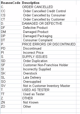
It will be apparent that there is considerably more information available for analysis in the base data before further analysis is required. If, in addition to this well-structured list there are other well-structured lists throughout the ERP Database then considerable further information can be extracted without the need to pull data into Excel and analyse manually.
Note also that as far as possible the codes are mnemonic and therefore it is quicker and easier to remember codes and post and also the code structure permits summarizing analysis.
2. Chart of Accounts in big brand ERP
Following is an extract from the Chart of Accounts in a multi-million Rand big brand ERP implementation that had to be trashed.
At the start of the Pulse Measurement Investigation the Chief Executive of the client corporation said to me "James, I have spent … million on this ERP installation, I have one production unit at present and they cannot tell me the cost per operational unit of that one unit, this time next year I will have eighty such units, what do I do?" In this case the client was seriously considering trashing their big brand ERP and buying another big brand ERP.
During the investigation I found that the client had employed a highly capable lady with a Bachelor of Commerce degree and five years' work experience who after six months of intense effort was unable to produce an Income Statement that was reliable!
Here is an extract from the Chart of Accounts:
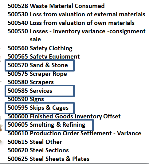
Notice that "Sand and Stone" is about as consumable an item as one can find, two accounts away from "Services" which was likely to be a fairly large expense, one account removed from "Skips and Cages" which are large capital assets and one removed from "Smelting and Refining" which was a capital asset amounting to hundreds of millions of Rands, but notice also that "Smelting and Refining" might also be related to operating expenses and NOT assets.
Notice that "Steel Other" occurs BEFORE other items relating to Steel whereas "Other" should be the posting of last resort.
Notice that "Scraper Rope" occurs after "Scrapers" where the rope is a component of the scraper.
Notice also that there is no pattern or logic in the coding either.
One of the business personnel responsible for this Chart of Accounts proudly told me that he had consulted a number of other businesses and pulled in everything that they had in their Charts of Accounts as well.
The senior Bookkeeper subsequently informed me that when she started with the company the Chart of Accounts ran to twenty five pages and she had spent six months narrowing it down to a list of sixteen pages in order to make it useable.
During a system walkthrough attended by the Client, the Implementers and representatives of the big brand software company when I pointed out the weaknesses of the Chart of Accounts one of the software company representatives started to argue with me that his software was "so powerful it can cope with that" – an absolutely foolish statement insofar as the issue I was raising related to a complete lack of logic or structure in the data.
At a subsequent meeting with the same representative he persisted in insisting that the Chart of Accounts was not that bad and referred me to the "Best Practice" Chart of Accounts off his company's website.
When I obtained that Chart of Accounts, this is what I found:
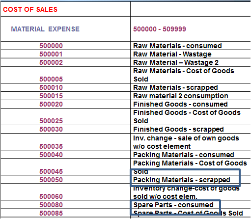
Again virtually no logic, no structure, no pattern in the coding, in fact seemingly completely arbitrary numbering.
He was right, the highly defective Chart of Accounts in the implementation of his client was NOT much worse than the so-called "best practice" Chart of Accounts.
At that point I understood for the first time that the large global organizations that sell and implement big brand ERP systems did NOT understand principles that I regarded as fundamental and essential to effective ERP implementation. I also understood more clearly why such implementations so frequently run over time and over budget.
Subsequently I have encountered similar deficiencies in sample data for various other big brand ERP products.
There is a HUGE opportunity to enhance your current ERP and BI investments using SEPT.
3. An example of a well-designed (SEPT) Chart of Accounts
So, what DOES a well-designed Chart of Accounts to JAR&A SEPT standards look like?
Following are some extracts from a Group Consolidation Chart of Accounts that JAR&A developed for a large manufacturing group recently:
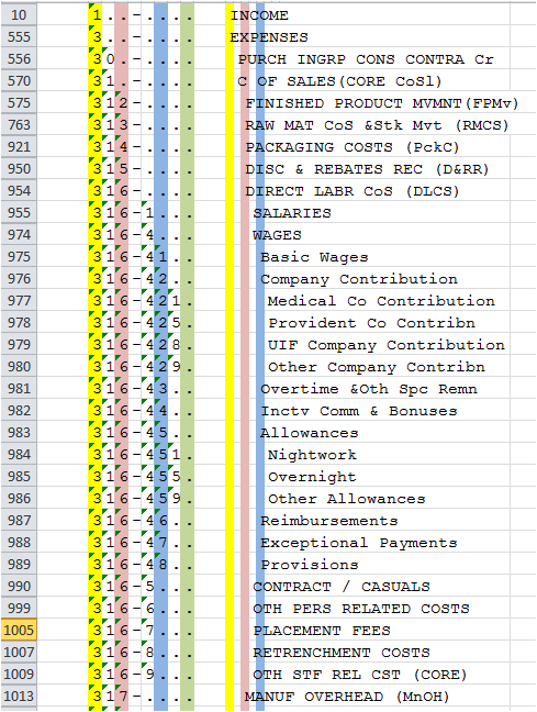
As you will see from the spreadsheet row numbers in the left hand column many rows have been hidden in the spreadsheet in order to make the hierarchy more readily visible.
Only the section relating to "Wages" has been left open at the lowest level of the seven level hierarchy to give some idea of the posting level detail.
The colours in the columns are simply to make the hierarchy easier to follow during development.
Notice the use of the delimiter "-" in the code scheme in order to break it into segments that make it easier to read and remember.
Notice also that headings in the hierarchy are in Capital Letters and that the hierarchy is indented to make it easier to scan and read.
Notice the trailing periods "." in the codes that correspond to the levels of headings in the hierarchy, these periods make the code easier to read, the hierarchy easier to follow and permit the incorporation of intelligent interpretation of the hierarchy in software, query and reports that work with the hierarchy.
Notice also that codes are spaced out over the full available range in order to provide space to add in extra items in the correct location if ever required.
Following is another view of the same Chart of Accounts:
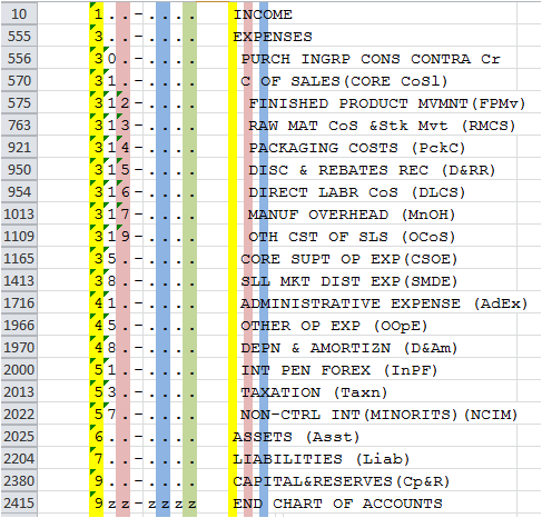
Here the accounts have been collapsed at the first level of the hierarchy with the exception of Expenses which is opened up at the second level and Cost of Sales which is opened up at the third level of the hierarchy.
What you will notice here is that a straight forward listing of the Chart of Accounts I.e. a Trial Balance gives a detailed Income Statement and detailed Balance Sheet and that only minimal further work is required to produce formal detailed Income Statement and Balance sheet.
This is in dramatic contrast to the previous examples where even the simplest Income Statement will takes days or weeks of work by an expensive resource to produce reports which may not even be very accurate.
At about the same time that I had the debate with the representative of the software company with regard to the "power" of their ERP I encountered another situation with another big brand ERP implemented at about the same time.
In this case the Chief Executive had just been forced to resign when, following implementation of his new big brand ERP by big brand implementers he had consistently reported to shareholders over a six month period that profits were improving significantly. At the end of the six months, when there was no money left in the bank he had to report that as a consequence of a configuration error in his big brand ERP the profit that he had been reporting was, in fact, a loss!
Someone had accidentally swapped the debit and credit accounts around somewhere in the configuration with the result that the financial statements were in error.
If you contrast the SEPT Chart of Accounts above with the examples earlier I am sure you can see how easy it is with the former Charts of Accounts to make such a mistake. Software vendors may well argue that their way of doing things is normal practice, that may be so but it does NOT make it acceptable practice, let along good practice and certainly NOT best practice as the man from the big brand ERP vendor had asserted to me.
Yes, there ARE grouping codes and other devices in these big systems to try and add logic to these illogical lists but, I hope by now you will agree with me that it is MUCH EASIER to build the logic in the foundational list from the start.
Notice that with the highly structured SEPT Chart of Accounts above a five line financial report summarizing the entire Chart of Accounts in account number order will give the balancing totals for the Income Statement and Balance Sheet and immediately show whether the accounts are in balance or whether there has been a posting error or configuration error somewhere.
When this is combined with the JAR&A Cubic Business Model superimposed on the General Ledger, every Location–Function element of the business has its own Income Statement and, where applicable, Balance Sheet and all performance management takes place directly off the GL with a dramatic improvement in Governance AND reduction in audit time and cost.
Couple this model to the configuration of all other modules and it becomes immediately possible to drill down on a value in the General Ledger into the source systems in order to obtain additional detail (assuming of course that you have SEPT configuration in all the other systems as well).
Note that you can achieve a significant proportion of this benefit by implementing SEPT configuration in your Data Warehouse and just tuning the poor lists in your ERP, which in most cases will be working after a fashion for operational purposes.
These problems occur in every area of every ERP I have ever looked at.
Another element of the Chart of Accounts above is that the expenses are sequenced from the most strategically fundamental to the most routine so that every person who accesses the Chart of Accounts has the Executive Strategic view of the financial priorities of the organization. This alone carries with it significant organization optimization benefits.
Following are a few other examples of poor quality data in major ERP implementations.
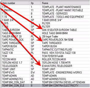
4. Item Master in a big brand ERP
5. Item Group in another big brand ERP
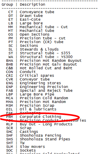
Again, no logic, no structure, nothing that corresponds with the concept of a logical way of grouping items.
6. Material Group in another big brand ERP
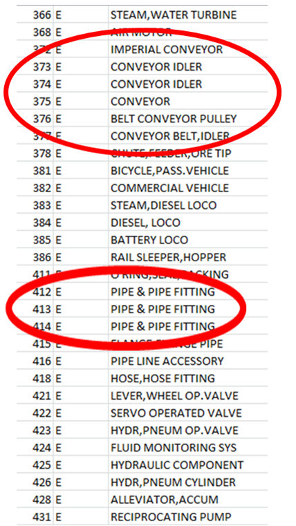
Duplication, no logic, no structure and nothing that gives any indication of a logical basis for "grouping" materials.
7. Etc
I could go on and on giving you examples but I hope that the above will have sensitised you enough to provide the incentive for you to go and have a look at the tables in your own ERP.
While they may not be as bad as the examples here, my experience tells me there is a fairly good chance they WILL be comparably defective or that, at best, they may be some limited way towards the recommended SEPT practice examples above.
I hope that this will provide you with the incentive to read further...

[MAKERATING]
The comment feature is locked by administrator.
Return